 It's tough not to be sidetracked from focussing on a company's image makeover when industry analysts, competitors and customers are falling over themselves saying what else needs to be done.
There are a lot of expectations riding on Indian, formerly known as Indian Airlines, which has changed everything from its name to the logo -- and plans a lot more. (The company name, however, remains unchanged: Indian Airlines Limited.) But more on that later.
Analysts agree on one point, however -- the timing of the strategy. "An Indian today is considered as making a difference, and his say is of significant value. That positive image of an Indian is being utilised well with the dropping of the suffix, Airlines," says Harish Bijoor, brand consultant and CEO, Harish Bijoor Consults Inc.
Wind beneath the wings
A makeover was long overdue. The last change at Indian Airlines Limited (IAL) was way back in 1967. That's when it changed its name from Indian Airlines Corporation to Indian Airlines and the green, winged logo was replaced by a slanting IA painted in white on an orange background. In the company spokesman's own words, every airline must revisit its brand every 10 to 15 years.
Besides, competition in the Indian airspace is increasing exponentially. Civil aviation ministry estimates place the growth in domestic passenger movement at over 50 per cent in the past three years: from 26.36 million in 2001-02, to 40.09 million in 2004-05.
Granted, IAL is also reaping the benefits of that increased traffic. Its balance sheet is also looking a lot better these day -- the state-owned carrier posted a post-tax profit of Rs 65.61 crore (Rs 656.1 million) in fiscal 2005.
 But aviation analysts point out that was more due to focused cost-cutting initiatives, than actual attempts to increase the customer base. Initiatives such as a better insurance deal and thrifty fuel tanking plans, that is, buying fuel from states where it is cheap, worked.
"We also looked at non-productive areas and ruthlessly cut costs there," says a senior company official.
Marketshare, meanwhile, was crashing. From close to 100 per cent in 1990, when private carriers were allowed to operate in Indian skies, IAL's share dropped to about 30 per cent in 2004.
Compare this Jet Airways's now-50 per cent market share (following last week's Rs 2,300-crore -- Rs 23 billion -- acquisition of Air Sahara). Even the three new, low-cost airlines together account for 15-16 per cent of the market. Their advantage (apart from the oh-so-obvious cost)? A youthful, vibrant image.
"With a young staff, ad campaigns and offers galore, the newly-launched airlines are a force to reckon with," says an industry analyst. The ministry of civial aviation estimates that air transport grew 24 per cent IAL needed to act, and fast.
Three, a proposed initial public offering is on the agenda some time in the next financial year. "That would mean a complete new set of stakeholders. The IPO was yet another impetus for us to look at our brand and image," says the company spokesperson.
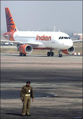
That's where the timing comes in. The new, leased A-319s were the first aircraft to bear the new logo.
"An airlines' biggest asset is its fleet," says the IAL spokesman. With 43 more to be acquired this year -- including A 319s, A 320s and A 321s -- IAL's older fleet will slowly be converted into cargo aircraft.
The A 319s are IAL's newest aircraft after 1993, when it bought 11 A 320s. The airline is likely to spend more than Rs 9,500 crore (Rs 95 billion) on the new aircraft and, as an industry analyst points out, "it would be silly not to make the most of it."
In flying colours
IAL obviously felt the same way. The empanelled agencies of the company were asked to submit their concept for the makeover. "The brief we were given was to come up with something that signifies change, but with an element of continuity," says Ajit Shah, executive director, R K Swamy BBDO, the agency that created the new logo.
The creative team considered several options -- the national flag, birds, animals and colours -- before zeroing in on the wheel from the Sun Temple at Konark, Orissa. "It signifies motion and represents the Indian image perfectly," adds Shah.
![]() That was phase one. What followed were intense discussions and brainstorming to develop the idea further. The final result is quirky blue spokes -- "signifying the sky, aviation and modernity," says Shah -- against a lively orange background, an attempt to establish continuity with the old logo.
That was phase one. What followed were intense discussions and brainstorming to develop the idea further. The final result is quirky blue spokes -- "signifying the sky, aviation and modernity," says Shah -- against a lively orange background, an attempt to establish continuity with the old logo.
More important was the dropping of the suffix "Airlines" from the name. "It seems simple, but is anything but that," says Bijoor, pointing out how the image and name change also involves a change in mindset -- from a plodding public sector undertaking to an airline that is ready to take on private airlines.
"But why change the name at all? "When we were named Indian Airlines, we were the only Indian airline. Now you have so many 'Indian' airlines. It's only fair that we attempt to change that," says the IAL spokesman.
Not everybody agrees. "Indian is such a generic name. It represents 100 crore (1 billion) people, their emotions, their movies... everything. I find it tough to accept it as a brand," declares A G Krishnamurthy, chairman, AGK Brand Consulting and founder and former CMD, Mudra.
Dipstick surveys also show that though people associate the new logo with the old one instantly, they aren't too comfortable with the name change.
"It is slightly controversial, and it will take some time to get used to," defends Shah. But the same exercise by several other airlines shows that it works. After all, American Airlines is now American and Sri Lankan Airlines is referred to as Sri Lankan.
But designers and brand consultants haven't accepted the new logo wholeheartedly, either.
"The wheel in the Konark temple, which was the inspiration for the new logo, is a 12-ft large, bulky monolithic structure. It is set in stone, static. How can it portray a service that means travelling across the skies?" questions Tarun Deep Girdher, graphic faculty designer, National Institute of Design (NID). (Incidentally, NID created the earlier logo, which has now been scrapped in the makeover exercise.)
Looking beneath the surface
IAL announced its new look with a television campaign -- also created by BBDO -- that ran for two weeks across all major cable channels. But Indian Airlines becoming Indian is such big news that the coverage it generated left all paid advertising in the dust. News channels covered the makeover extensively, as did all the major newspapers.
Almost all the dailies ran photographs of the new A 319, the new logo and the new name -- creating more publicity for the airline through word-of-mouth than any paid ad could ever hope to achieve.
But a logo and name change is just part of the story. More important is the overall image of the airline. If the new look has to seep into every visible part of the airline, that means rejigging close to 60 touch points -- from the ticket, the counter, the colour of the floor inside the aircraft, to the uniforms and the standard of service.
"The logo and the livery make up just 5 per cent of the entire image," points out Preet Bedi, president, Rediffusion DY&R. Changing all that is a much more onerous task, but IAL promises it is up to the challenge.
"A new look comes with strings attached," warns a brand analyst. "Indian will have to pay attention to the customer-airline interface as well." "My only worry is the company struggling to live up to the expectations. A brand is not just about cosmetic changes but about the experience, too," seconds Bijoor.
That's going to happen, says IAL. In the pipeline are new uniforms for the staff (although the saree may still not make way for western outfits for the female cabin crew); new interiors for the craft and new crockery and flatware; and upgraded in-flight entertainment such as personal screens, radios and so on.
"The average age of the cabin crew will come down; hardware in backoffice operations is being upgraded, as is the reservation system," details the spokesman.
The new brandname will find its way onto everything associated with the airline over the next month -- signages, tickets, baggage tags, stationery, boarding passes and so on. "I am a regular flier but I haven't seen any change yet. It is vital for the company to bring about uniformity in the look and feel of the airline at every touchpoint," says Bedi.
Of course, the bigger physical changes will take time. While all the new aircraft will be emblazoned with the new logo, the old aircraft will be repainted only during their "major maintenance" cycles -- every 12 to 18 months -- when they are painted anyway.
By end-January, six aircraft will have been repainted; that number will increase to nearly 20 by the end of the fiscal year. All in all, IAL hopes to have the makeover complete in the next 12 to 18 months.
"It is taken for granted that a private company will have a fresh image and a PSU needs to look like a drab dowager," says the IAL spokesman.
(Above) An 'Indian' -- formerly Indian Airlines -- Airbus A-319 at the Indira Gandhi International Airport in New Delhi.
Photograph: Prakash Singh/AFP/Getty Images


 © 2025